June 2, 2026
I Tried Making My Own Fonts, Part I
... and was only moderately successful 🫠
I had a brief foray into something I’ve always been interested in: font-making. It proved to be a lot more difficult (and time-consuming) than I was expecting.
Quick shoutout to Linus Boman — I’ve watched a lot of his videos critiquing fonts used in brand marketing.
handwriting
Last autumn, I decided I wanted to make a font out of my usual handwriting. Newly equipped with an iPad for university, I spent a few hours quickly making a handwriting font using Calligraphr’s base template and GoodNotes. The whole process was pretty simple — I just downloaded the template from Calligraphr, wrote out all the characters, uploaded it, and downloaded the .ttf file (which I later converted to .woff2 format for my website). It’s called Tapioca because why not be whimsical when choosing the names of my own fonts?
Hello! This is my handwriting font called Tapioca. Hopefully it is rendering correctly. Honestly, I’m pretty happy with the way this one turned out. Ten-year-old me would have gone crazy with this font on my tri-fold posters for school projects.
Generic test:
The quick brown fox jumps over the lazy dog.
cursive
I’ve been doing calligraphy for years (see examples below), so I thought this would be fun, and I could end up with a nice aesthetic calligraphy font to use. Oh, how wrong I was.
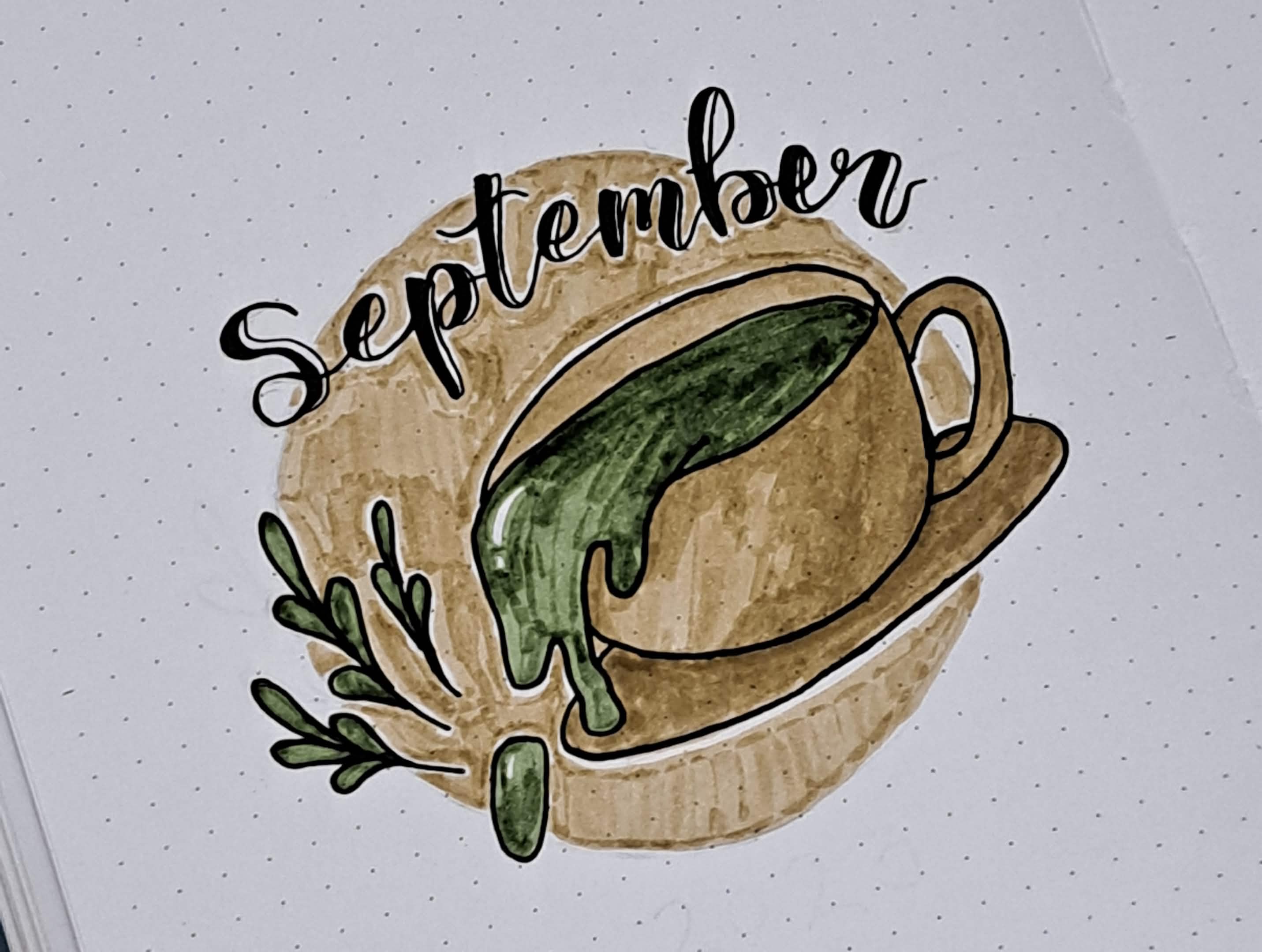
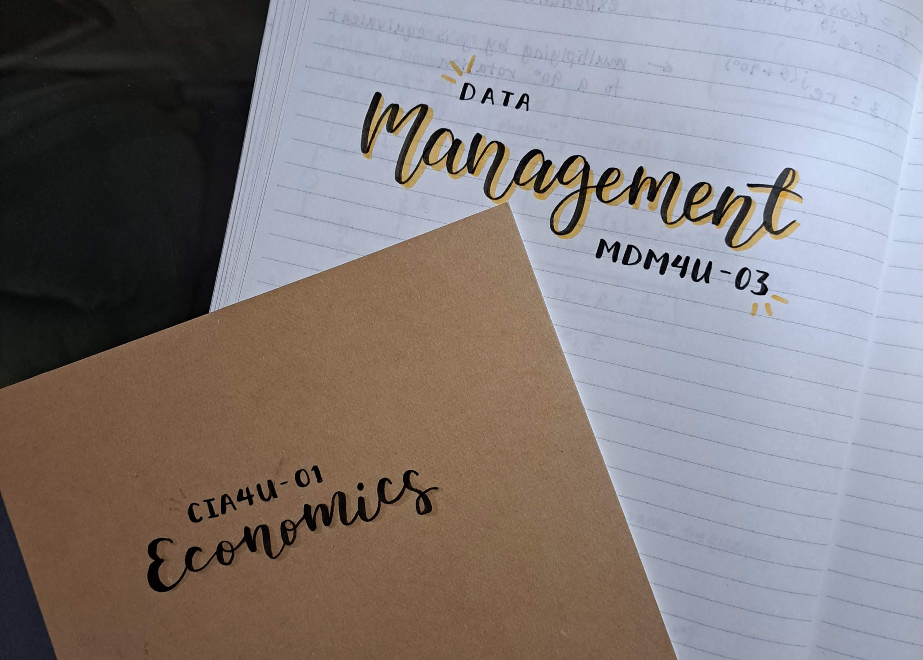
Getting letters to look consistent is extremely difficult, especially when I’m used to writing calligraphy as an entire line, not as individual letters (I mean, that’s basically the whole point of cursive). My letters have very inconsistent slope, height, and spacing… the font just does not look cohesive. :( I have noticed that generally, cursive fonts have more of a slant, so I’ll probably try to implement that on my next cursive font iteration.
I used Calligraphr again for the base template and spent an hour or so writing out the individual characters on my iPad. Then after downloading the .ttf file, I saw that the letter spacing wasn’t reduced enough, so I used Glyphr Studio to further reduce the letter spacing until they mostly connected.
So… here’s a preview of my cursive font, Bellflower:
This text should be rendered in my cursive font that I named Bellflower; I have to say, it is almost comical how unreadable and inconsistent this is. I promise my real calligraphy is a lot better-looking.
Generic test:
The quick brown fox jumps over the lazy dog.
what’s next…!
I have big plans for improvements, since I find font (and graphic) design really interesting. And I do plan on making my fonts look better, whenever I end up having the free time and motivation to get back to this. Stay tuned for Part 2. :)